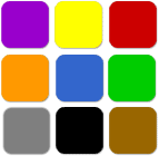
Blue (Trusting, Calming, Comforting, Quality, Dependaility)
Do you have a blue power suit, blue chip stocks, or true blue friend? Blue has many meanings. First, it has calming and comforting (clear blue sky and clean blue water). Companies who want to portray soothing, calming, or peaceful feelings (Dove, baby products, spas) often use this color. Blue also represents trustworthiness, dependability and quality. It is the primary corporate color. Can you think of a Fortune 500 company that doesn't have blue in the logo? Blue is also a chilly, cool color that represents winter and snow.
When your red, yellow or orange web site is too much, add a bit of blue to cool it down. Yet another use for blue is for diet and fitness items because the color blue is an appetite suppressant. When you look at blue do you feel hungry? Blue works best when used with other shades of blue. Don't overdo it though, too much of this shade can actually give you the blues.

Green (Calming, Peaceful, Harmony, Refreshing)
Another color we see in nature is green and like blue it is a calming and peaceful color and reminds us of plush green grass, trees, and plants. Of all the colors green is actually the easiest on the eyes (which is why we like to look at money.) Use this color on your web site if you want to promote environmental issues, or insinuate growth either in the garden or profit sense. Use green with beige or brown to promote organic products.
Consider using green as a secondary color or it loses it peaceful affect. Green isn't all environmental and business, it can be punchy and spunky when combined with bright orange or yellow.

Purple (Wisdom, Sympathy, Honor, Royalty)
Purple, and its many shades, is perhaps the upper class of colors and represents wisdom, sympathy, honor, and royalty. The Purple Heart medal is the oldest military medal still issued and was created by George Washington. It is also perceived as the color of royalty. Keep in mind that shades that are too gray or light don't carry the same weight.

Yellow (Fruity, Sunny, Caution, Activates Memory)
Yellow can be sunny, fruity and cautious. The most visible color combination is black lettering on a yellow background (think cabs), so if you really want something to pop, or are creating a site for the elderly, consider this combination. Yellow can represent freshness, sunny, joy, happiness, warmth, but too much can be blinding, so use caution when using yellow. Since it is bright, works well as an accent, complementary color, or to highlight an important point. "Buy Now", "Click Here", or "Free" graphics stand out with yellow.

Orange (Creativity, Grabs attention, Stimulates appetite, Social)
Orange is a color that gets people psyched! It actually stimulates mental activity and creativity and screams pay attention (construction signs), energy (oranges), and power. For all of the above reasons you will often see orange in ads and websites promoting children's products, or art-related items. It is also a social and feel good color (changing Fall leaves, pumpkin pie, Halloween.) You often see orange coupled with blue which represents power and dependability.

Red (Passion, Anger, Spicy, Heat, Danger)
Red is a tense color that elicits strong emotions such as passion, anger, spicy, heat, and danger. These strong emotions can trigger hunger which is why you normally see red used in food product advertising. Red is also the color of rage and anger so be careful how often you use it. Like yellow, it is a good choice for "Buy Now" graphics.
Pink is the color of fondness, appreciation, sympathy, and love.
While red is more serious pink is playful, delicate and feminine. Used along with black, gray or silver pink becomes a sophisticated color. If you use pink with light yellow and blue, you have a delicate combination often used to advertise baby products.

Black (Retro, Upper Class, Mysterious, Restful emptiness)
Black is considered elegant, formal (black-tie affair), modern, but also retro, upper class, mysterious and serious. White is mostly used in graphics as a neutral background, but it also represents, cleanliness, tranquility and innocence. White letters on dark backgrounds stand out better than dark letters on a white background.
In fact, a design secret for billboard advertising is to use white letters on dark backgrounds because the signs are more effective. They are noticed and easily readable. Next time there is an election, pay attention to the candidate's names and you'll notice they are following this rule.

Gray (Reliability, Neutral, Stability, Creates expectations)
Gray represents reliability, neutral, and stability, but it can also be boring unless paired with other colors. It is great for office-related websites that promote high productivity. Play around with this color in your graphics.
Light shades may be substituted for white, or perhaps a dark slate gray is a better option for your image than black. Gray paired with one other color such as pink or lavender can have an upscale feel.

Brown (Orderliness, Dependable, Comforting, Wholesomeness)
Brown can do a lot for you. If used right, brown is an elegant and decadent color that triggers hunger. It is also dependable (think wood and UPS), and comforting. Copper and bronze are being used more frequently for beauty and spa products.
These colors denote a "tan" which people relate to health and beauty. Of course right now, brown paired with sky blue is a very sophisticated combination.
